Colorful Maximalist Decor: 10 Bold Color Ideas That Feel Curated, Not Cluttered
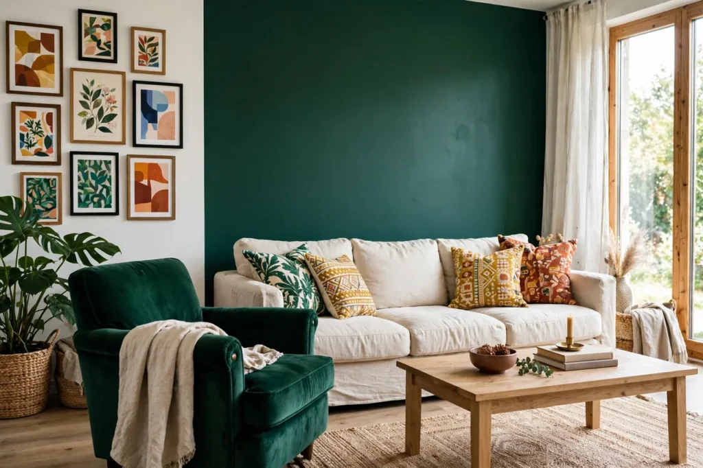
The short answer first
Here is the whole secret in one sentence: pick three colors that share one story, put the color in as deliberate features on a calm white base, and leave breathing space everywhere else.
Colorful maximalist decor is the 2026 answer to years of beige rooms: more color, more pattern, more texture — but curated, not chaotic. The difference between a room that feels rich and a room that feels like a yard sale is not how much color you use. It is whether the color has a plan. Every idea below follows the same plan: one palette, one bold feature at a time, and a calm base that lets the bold parts shine. (UK readers know it as colourful maximalism — same idea, same rule.)
That is also why this guide works on a white home. The white is not the enemy of maximalism here. It is the frame. A jewel-tone sofa glows against white walls. A drenched wall reads as confident, not loud, when the other three walls stay quiet. The FunHaus trick applies here too — one bold feature, everything else calm — just with color doing the talking instead of stripes.
1. Start with a power palette — three colors, one shared story
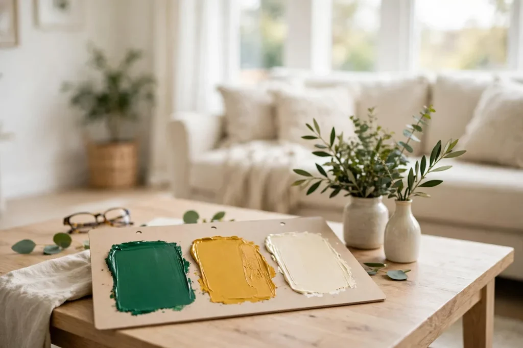
Before you buy a single cushion, pick three colors that share one story. That is the whole job of a power palette, and it is the step most people skip — then wonder why the room feels random.
A shared story can be a place (a garden: emerald, terracotta, cream), a season (autumn: mustard, burgundy, warm white), or a mood (jewel box: sapphire, emerald, gold). The story is what makes three loud colors feel like they belong together. Without it, you have three loud colors arguing. With it, you have a palette.
Use the three colors in unequal amounts so the room has a hierarchy: one main color does about half the work, one supporting color about a third, and one accent color just pops up in small places — a book spine, a vase, a cushion edge. A colorful maximalist living room built on emerald, mustard, and cream works because emerald leads, mustard supports, and cream gives the eye somewhere to rest. Swap the roles and it still works. Lose the cream, and the room starts shouting.
Write your three colors on a sticky note and keep it in your bag when you shop. If a piece does not match at least one of them, it does not come home, no matter how pretty it is. That one habit is the difference between curated and cluttered, and it costs nothing. The calm white base underneath it all is the same thinking behind our warm minimalism approach: the base stays quiet so the color can speak.
2. Color-drench one wall — and only one
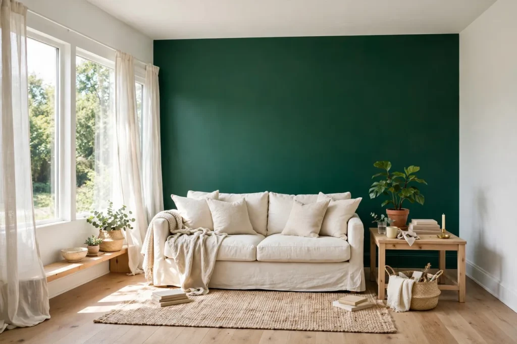
Color drenching is the technique everyone is talking about in 2026, and it is simpler than it sounds: paint one wall, its trim, and maybe the ceiling above it all in the same color, so the color wraps the corner like a blanket. Done on one wall, it looks confident and expensive. Done on all four walls, it looks like the room swallowed a paint can.
Pick your boldest palette color for this wall — emerald, cobalt, burgundy, or a deep teal — and keep the other three walls white. The white walls are doing real work here: they frame the drenched wall and give the room its breathing space. Paint the skirting board and any picture rail in the same color too, because matching trim is what makes drenching look intentional instead of unfinished. A gallon of good wall paint runs about $30 to $50, and one wall in a normal living room usually takes less than a gallon.
Renters, you are not left out. A peel-and-stick mural or a large fabric panel in your drenched color gives you the same wrapped feeling, and it comes down clean on moving day. Or drench the smallest wall you own — the wall behind a bed, or the short wall in a hallway. Small wall, same thrill, smaller commitment.
If the color feels too strong once it is up, do not repaint. Add one cream cushion and one light-wood frame on that wall, and the color softens by itself. Drenching is a test you can adjust, not a tattoo.
3. One jewel-tone statement piece
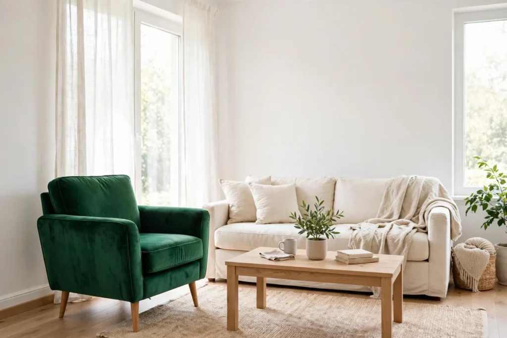
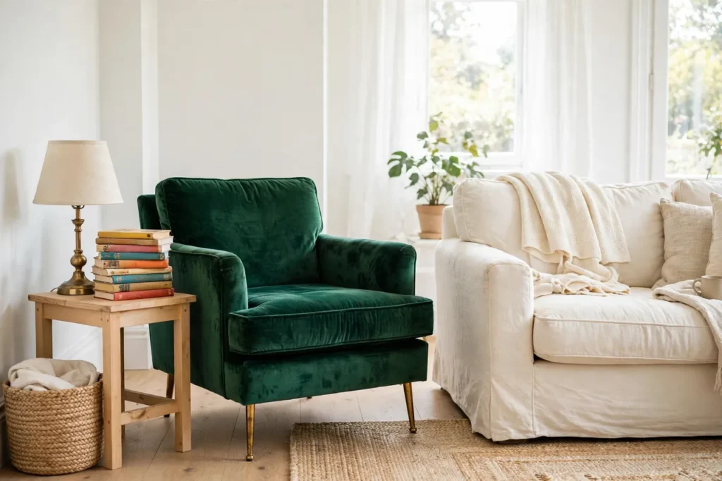
If paint feels like too much commitment, buy the color instead. One jewel-tone statement piece — an emerald velvet armchair, a sapphire velvet sofa, a ruby ottoman — gives a room its entire personality in a single move, and everything else in the room can stay exactly as it is.
Jewel tones are the workhorses of this trend for a reason: emerald, sapphire, ruby, and deep teal all glow against white, cream, and light wood, and they look expensive even in budget fabrics. Velvet is the classic choice because it catches the light and changes shade as you move past it, which makes one piece feel like three. A jewel tone living room built around one emerald chair costs far less than a whole-room makeover, and guests will remember the chair, not the walls.
Buy it secondhand if you can. Velvet armchairs in jewel tones turn up constantly in thrift shops and resale listings, often for $80 to $150, because someone else bought the color and then got scared of it. Their fear is your bargain. A new velvet armchair runs about $200 to $400, and a pair of jewel-tone cushion covers — the cheapest version of this idea — runs about $25 to $40.
One piece only. Two jewel-tone statement pieces start competing, and three turn the room into a jewelry box with the lid off. If the chair is emerald, the cushions stay cream. The chair is the star; the rest of the room is the audience. The same one-jewel-tone discipline is the spine of our Neo Deco guide, where emerald and brass do exactly this job.
4. The pattern-mixing rule — different patterns, one shared color
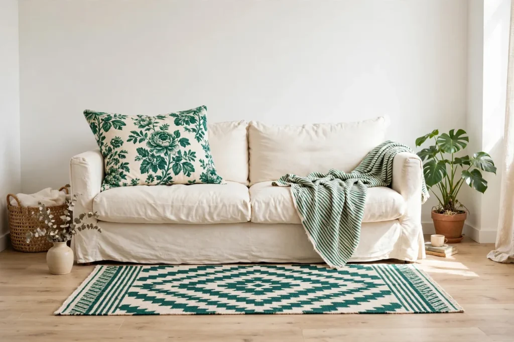
Mixing patterns in a living room is where maximalism either sings or falls apart, and the rule that saves it is short: different patterns are fine as long as they share one color.
That shared color is the thread that ties the room together. A big floral cushion, a small striped throw, and a medium geometric rug can all live on one sofa if the same emerald, or the same mustard, appears in all three. The patterns are different in scale — big, small, medium — so they do not fight each other, and the shared color makes them read as a family instead of a pile.
Start with three patterns, not five, and give each one a different scale. The biggest pattern goes on the biggest surface (the rug or the curtains), the medium pattern on the cushions, and the smallest pattern on the throw or the lampshade. If two patterns are the same size, they argue. If they are different sizes, they take turns.
Here is the test before you buy: hold the three pieces together in daylight. If your eye jumps from one to the other and back, they are arguing. If your eye moves across them smoothly, they are a family. And if it still feels busy, remove one pattern, not the color — the color was never the problem. Most pattern-mixing disasters are really a missing shared color, not too much pattern.
5. A maximalist gallery wall — with breathing space
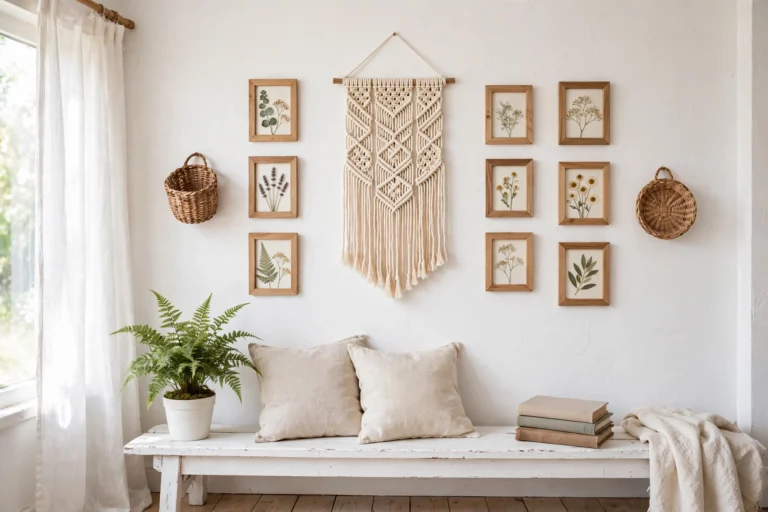
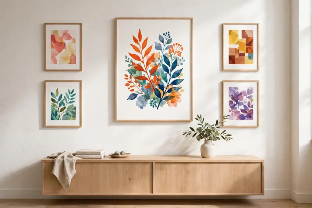
A maximalist gallery wall is a collection, not a crowd, and the difference is breathing space. The formula is simple: one anchor piece, two medium pieces, two small pieces, and plain wall showing between all of them.
The anchor is the biggest frame, hung at eye level, and it sets the color story — a bold print, a vintage poster, a piece of textile art. The two medium frames go beside it, the two small ones fill the edges, and every frame gets at least 2 to 3 inches (5 to 8 cm) of plain wall around it. That white space is not empty. It is what makes the wall read as a gallery instead of a noticeboard.
Repeat one color from your palette in at least three frames, and keep the frames themselves simple — thin light-wood or plain black frames, all the same finish, so the art does the talking and the frames do not. A gallery wall built this way costs about $20 to $60 if you print your own art and use thrifted frames, which is the cheapest big-impact idea in this guide.
Resist the urge to fill every inch. A gallery wall that covers the whole wall with no gaps looks like wallpaper, and wallpaper was not the plan. Leave one corner of the wall empty on purpose. That empty corner is the proof that you chose every piece, and choosing is what curated means.
6. Layered textures on a calm base
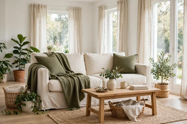
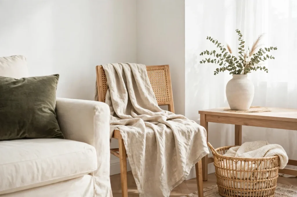
Here is the quietest idea in this guide, and the one that makes all the others work: let texture do the maximalism, not more color. Velvet, linen, rattan, wool, and wood, layered on a calm white base, make a room feel rich and collected without adding a single new color.
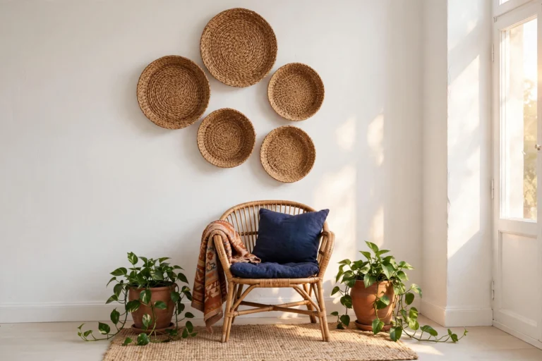
The base stays white — white walls, a cream sofa, light wood floors — and the texture arrives in layers. A velvet cushion next to a linen cushion. A wool throw folded over a rattan chair. A woven basket beside a smooth ceramic vase. Your hand feels the difference before your eye names it, and that is the point: texture is maximalism you can touch, and it never shouts.
Work in threes again: one smooth texture, one soft texture, one rough texture per seating spot. Smooth linen, soft velvet, rough rattan — the contrast is what makes each one show up. If everything is soft, the room feels sleepy. If everything is rough, it feels unfinished. The mix is the magic, and the white base is what lets you see it.
This is also the cheapest way to test whether you even like maximalism. Cushion covers, a throw, and a basket cost about $30 to $60 together, and if you decide the look is not for you, you have lost nothing and gained three useful things for the house.
7. Maximalist small space — one corner, one color
Small rooms do not need less maximalism. They need smaller maximalism. A maximalist small space works when the color lives in one corner instead of spreading across the whole room.
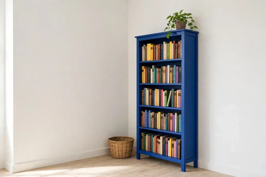
Pick the corner people actually look at — the reading corner, the shelf wall, the nook beside the window — and give it the full treatment: one bold color, one pattern, one texture, all in that corner. A cobalt bookshelf against a white wall, with mustard books and one emerald plant pot, is a whole maximalist moment in about 3 feet (90 cm) of room. The rest of the room stays calm, and the corner becomes the thing guests photograph.
The tricks that make it work are vertical and reflective: go up the wall instead of out into the floor, and add one mirror so the color doubles without taking up any space. A small room with one bold corner feels bigger than a small room with color sprinkled everywhere, because the eye has one place to land and the rest of the room can breathe.
Renters, this is your best maximalist idea after cushions. One bold shelf, one painted bookcase, one gallery mini-wall — all of it moves with you, and none of it needs a landlord’s permission. Start with the corner, live with it for a month, and let it teach you what the rest of the house wants.
8. A maximalist bedroom — one drenched corner, bold bedding, rest calm
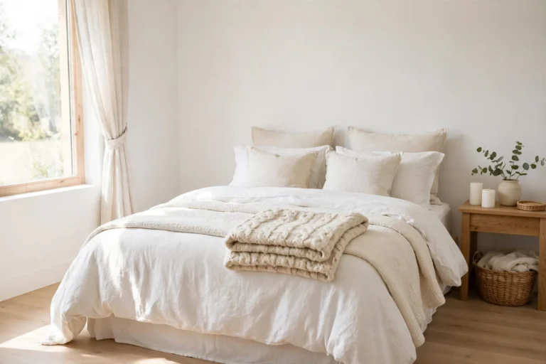
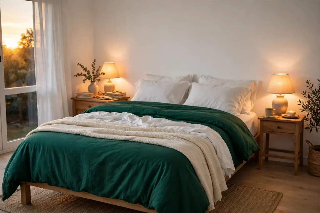
The bedroom is where maximalism goes wrong fastest, because it is the room where you need to fall asleep. The fix is the same rule, applied gently: one drenched corner or one bold bedding set, and the rest of the room stays calm.
Choose your one bold move. Either drench the wall behind the bed in your deepest palette color, or dress the bed in bold bedding — a jewel-tone duvet, a patterned cover in your palette — but not both at once. A drenched wall plus bold bedding plus patterned curtains is three loud features in the room where you sleep, and your brain will notice at 2 a.m. even if your eyes do not.
Layer it the simple way: white sheets, the bold duvet folded back about 12 inches (30 cm) so the white shows at the top, one cream throw across the foot of the bed, and a plain lamp on each side. In the evening, warm light (2700K) makes jewel tones glow instead of glare, which is the whole difference between a bedroom that feels rich and one that feels restless.
A bold bedding set runs about $40 to $70, and one wall of paint about $30 to $50 — so this is a weekend project, not a renovation. And if the color keeps you awake, swap the bedding back to white for a week. The wall will still be there when you are ready, and the calm will have taught you exactly how much bold your bedroom wants.
9. The kitchen test — one bold cabinet color
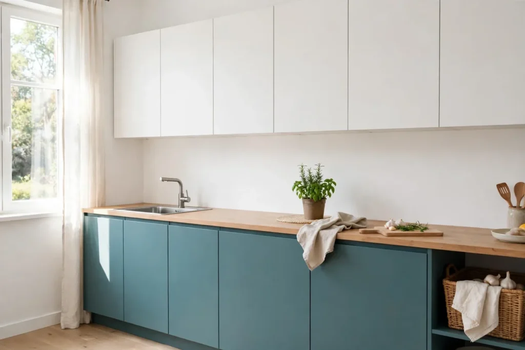
The kitchen is the smartest place to test maximalism, because it is the room you pass through, not the room you sit in all evening. One bold cabinet color — a single lower cabinet run, or just the island — gives you a daily dose of the trend without living inside it.
Pick one color from your palette and paint the lower cabinets, or the island, in it. Dusty teal, deep emerald, and warm burgundy all work beautifully against white upper cabinets and white walls, and the white up top is what keeps the kitchen feeling bright and clean. The color lives below eye level, which makes it feel grounded instead of loud — like a good pair of shoes under a plain outfit.
A quart of cabinet paint runs about $15 to $25, and a lower cabinet run takes a weekend of sanding, priming, and two coats. Do the prep properly: cabinets that are not sanded and primed will chip within months, and chipped bold cabinets look worse than plain ones ever did. If painting feels like too much, start even smaller — paint just the island, or swap the cabinet handles for brass ones in a bold finish. The same one-bold-feature discipline is behind our FunHaus kitchen test, where one dusty red cabinet run does the whole job.
If you love it after a month, you can carry the color into the dining room with confidence. If you do not, one cabinet run is a weekend to repaint, not a kitchen to regret.
10. The budget route — one statement piece first, the rest thrifted or owned
Here is the honest truth about maximalism on a budget: you do not need to buy the look. You need to buy one thing, and then let the rest of the house catch up.
Buy one statement piece first — the jewel-tone chair, the bold rug, the gallery anchor print — and build the room around it with what you already own and what you can thrift. A thrifted brass lamp for $10, a woven basket for $8, a stack of colorful books you already own, a plant cutting from a friend. The statement piece sets the palette, and everything else just has to match one of its three colors. That is the whole budget strategy, and it is how dopamine decor works in real homes instead of shopping lists.
Shop thrift stores with your sticky-note palette in your bag, and buy only what matches it. A $5 vase in your accent color is a better buy than a $50 cushion in a color you do not own yet. Check for quality in daylight before you buy — wobbly chairs and stained fabric are not bargains at any price — and wash or wipe everything before it comes inside.
This is also the slowest way to decorate, and that is a feature, not a flaw. A room collected over months, one matching piece at a time, looks more curated than a room bought in one afternoon, because every piece in it was chosen, not just delivered. Start with the statement piece. The rest will find you.
What it all costs
Every price below comes from the ideas above — nothing new has been added here.
| Budget tier | Example picks — choose one | Rough total |
|---|---|---|
| Under $25 | Cabinet paint quart ($15–$25), thrifted brass lamp ($10), woven basket ($8), thrifted vase ($5) | from $5 |
| Under $50 | One wall of paint ($30–$50), jewel-tone cushion covers ($25–$40), gallery wall with printed art and thrifted frames ($20–$60), one wall of peel-and-stick for renters ($30–$50) | from $20 |
| Under $100 | Bold bedding set ($40–$70), layered textures — cushion covers, throw, basket ($30–$60), thrifted velvet armchair ($80–$150) | from $30 |
| Over $100 | New velvet armchair ($200–$400), large rug in your palette ($100–$250) | from $100 |
Start with the cheapest test first. One bold cushion or one thrifted lamp will tell you whether color belongs in your home, and if it does, the rest of the list will still be here.
The one rule, one more time
If you remember nothing else from this guide, remember this: three colors, one story, one bold feature at a time, on a calm white base. That is the difference between a home that feels curated and a home that feels cluttered. Maximalism is back because beige got boring, not because chaos got beautiful — and the best way to honor the color is to give it a plan and give it space to breathe.
Now pick your three colors, pick your one feature, and start with the wall. You will know by tonight whether bold color is your thing. It probably is.
How do I decorate maximalist without clutter?
Pick three colors that share one story, put color in as deliberate features on a calm white base, and leave breathing space everywhere else. One bold feature at a time — one drenched wall, one jewel-tone piece, one gallery wall — is what keeps maximalism curated instead of cluttered.
What is colorful maximalist decor?
Colorful maximalist decor is the 2026 trend of layering bold color, pattern, and texture with one unifying color story, so the room feels intentional and rich instead of chaotic. It is maximalism’s answer to years of beige minimalism — curated abundance, not clutter.
What is color drenching?
Color drenching means painting one wall, its trim, and sometimes the ceiling above it all in the same color, so the color wraps the corner. Done on one wall with the other walls white, it looks confident and expensive; done on all four walls, it overwhelms the room.
How do I mix patterns without clashing?
Use different patterns that share one color, and give each pattern a different scale — big, medium, small. The shared color ties them together as a family, and the different sizes stop them from fighting each other. Start with three patterns, not five.
Can maximalism work in a small space?
Yes — keep the color in one corner instead of spreading it across the whole room. One bold bookshelf, one gallery mini-wall, or one drenched corner gives a small room a maximalist moment, while the rest of the room stays calm and the eye has one place to land.
How much does maximalist decor cost?
Very little to start. A quart of cabinet paint runs about $15 to $25, jewel-tone cushion covers about $25 to $40, and a thrifted velvet armchair about $80 to $150. The most generous move, a new velvet armchair, is about $200 to $400 — but one thrifted statement piece is enough to start.
Last updated: November 2026